AVALOQ

From messy navigation to an intuitive dashboard experience

DURATION

1 month

TEAM

PO, BA and Dev

CLIENT

Avaloq

01
Context

Client Lifecycle Management (CLM) is Avaloq’s web-based platform that automates and manages the entire client journey for banks — from onboarding to account closure. The dashboards are packed with data and are deeply integrated with Avaloq’s core banking system.

02
Problem

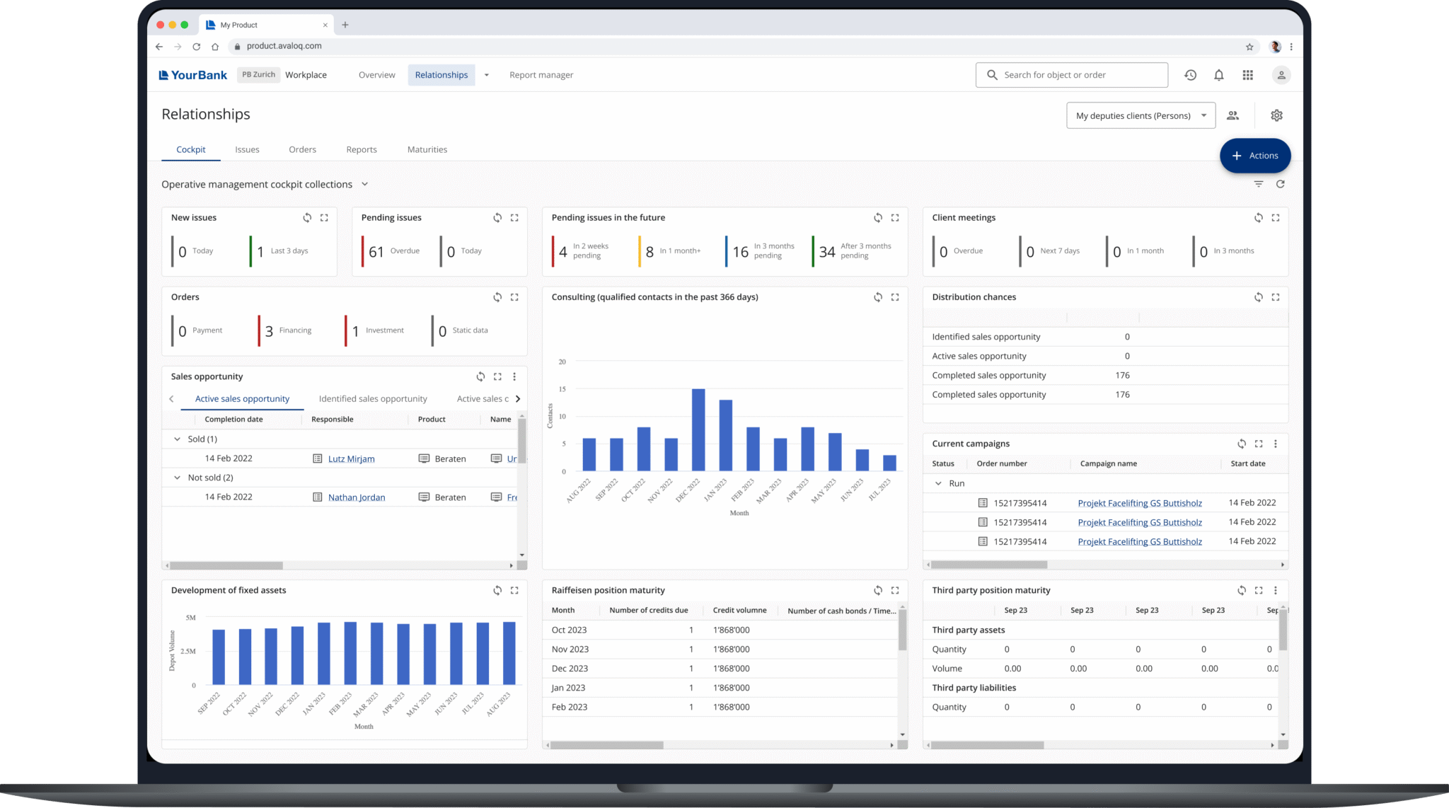
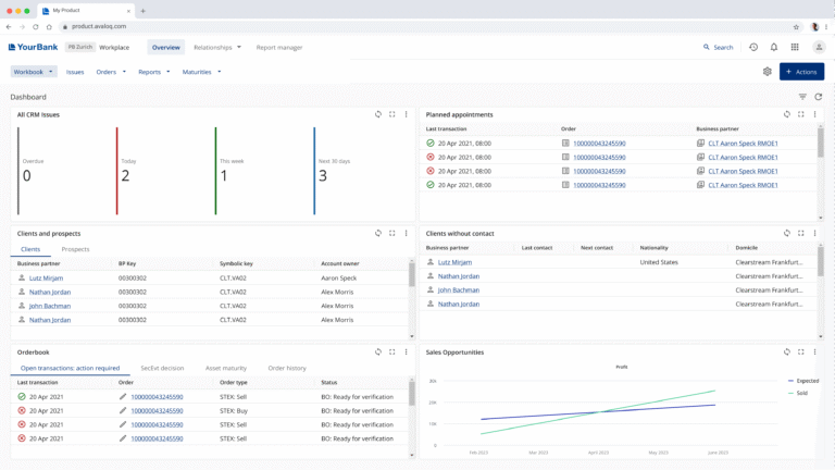
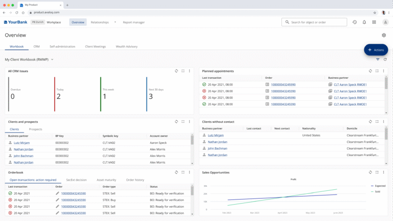
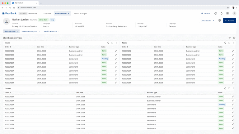
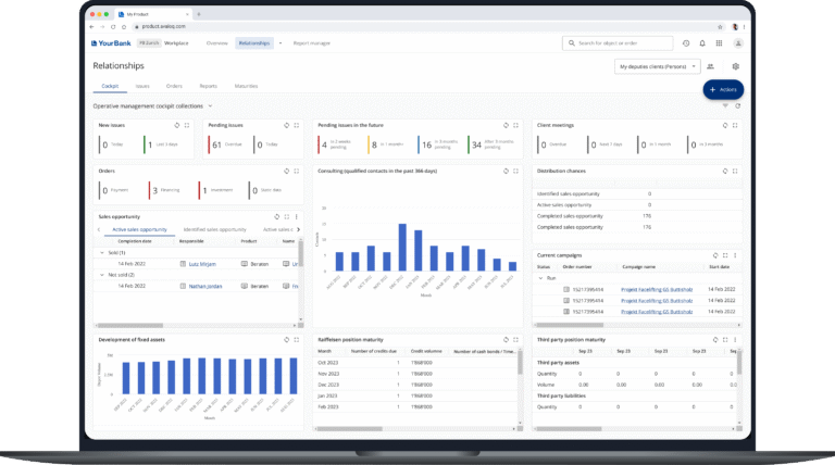
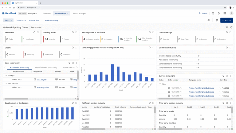
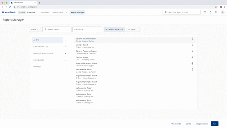
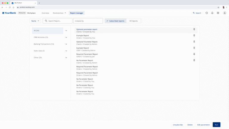
The existing horizontal navigation was cluttered, inconsistent, and took up too much space on screen. Users struggled to find relevant information across dashboards, which affected efficiency and focus. The lack of visual coherence also made the overall experience feel fragmented.

03
Process

  • Research: we analyzed user workflows and gathered feedback from internal teams and users to identify pain points in navigation, layout, and screen space usage.
  • Information architecture: I restructured the navigation hierarchy to make it more logical and predictable across dashboards.
  • UX Design: I introduced a tab-based navigation pattern that reduced clutter, freed up vertical space, and created a cleaner layout focused on data.
  • Design system: I aligned styles, spacing, and interaction patterns to ensure consistency across all CLM dashboards and future scalability.

04
Outcome

  • A cleaner and more intuitive navigation system that saves screen space.
  • Simplified access to key data and tools, improving focus and efficiency..
  • Visual and behavioral consistency across the entire CLM product.
  • A scalable solution that strengthens CLM’s overall user experience and design coherence.

looking for a design that makes an impact?

CLAUDIA
LAHUERTA

claudialahuertap@gmail.com

Download my CV
See my Linkedin